History of TSAC in stickers
The TSAC has a special tradition of designing a new sticker every year. However, every year it appears that tastes differ, so that there is now a "nice" collection of various stickers with both favorable reactions and a lot of criticism. The PubliCie takes you through the history of the TSAC sticker and the reactions it has provoked.
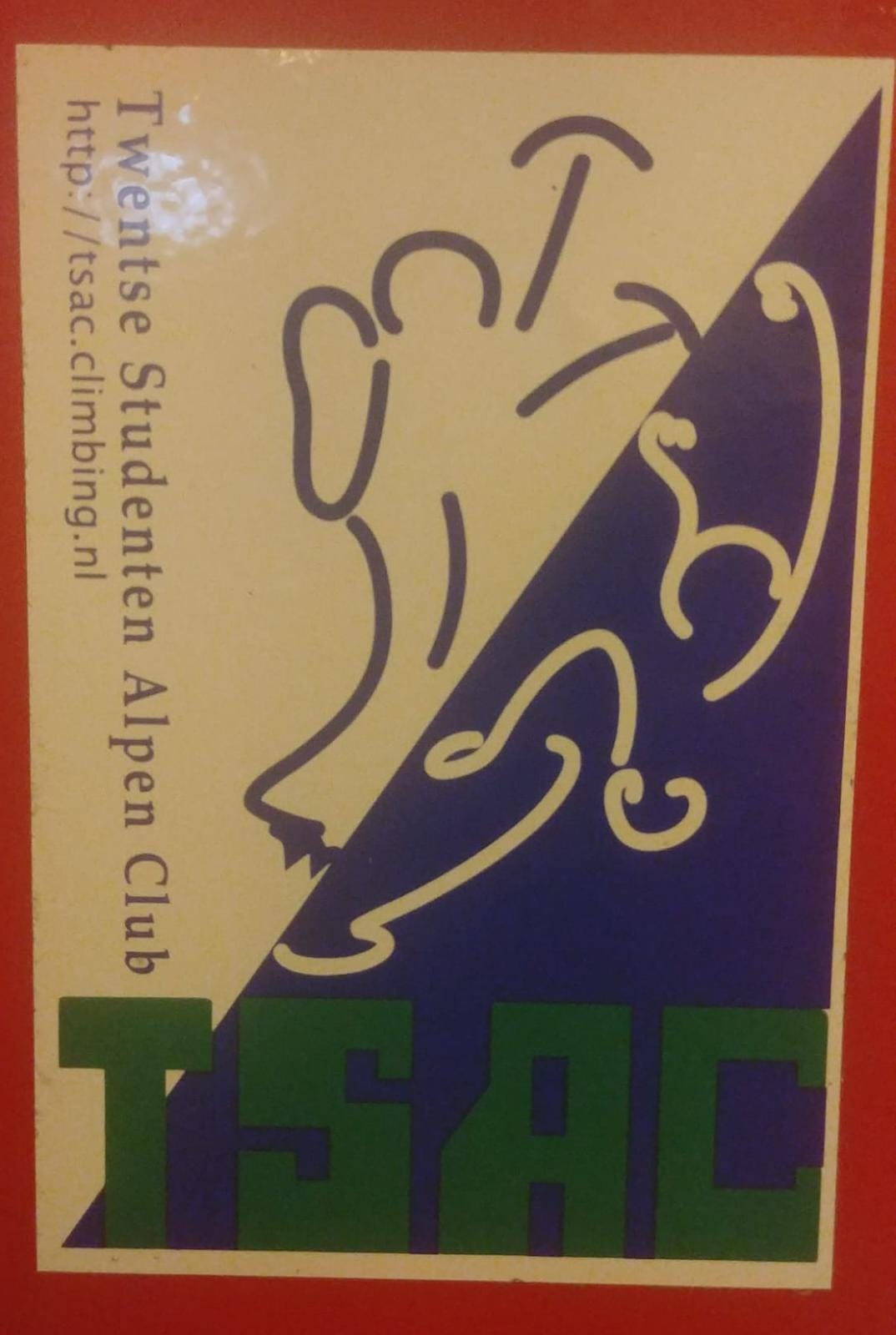
The oldest sticker still circulating among current TSAC members. It reflects the ice climbing and rock climbing across the diagonal in white-blue. This sticker is almost so pretty you'd get it tattooed on your shoulder.
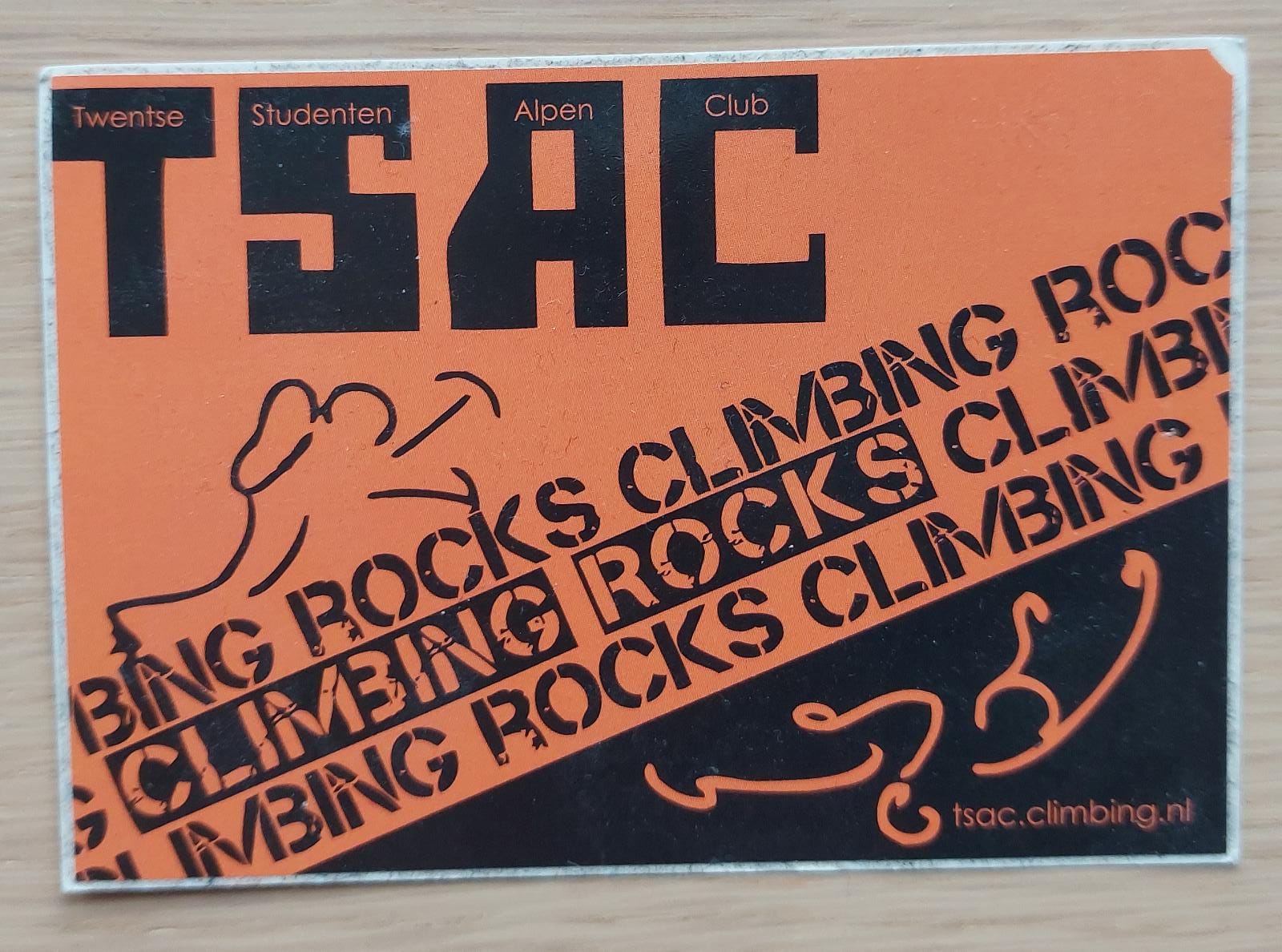
Inspired by the previous sticker, but in a new look with cool text. A first attempt to make orange the TSAC color. And for all ignorant members, it is also clarified what the abbreviation actually stands for.
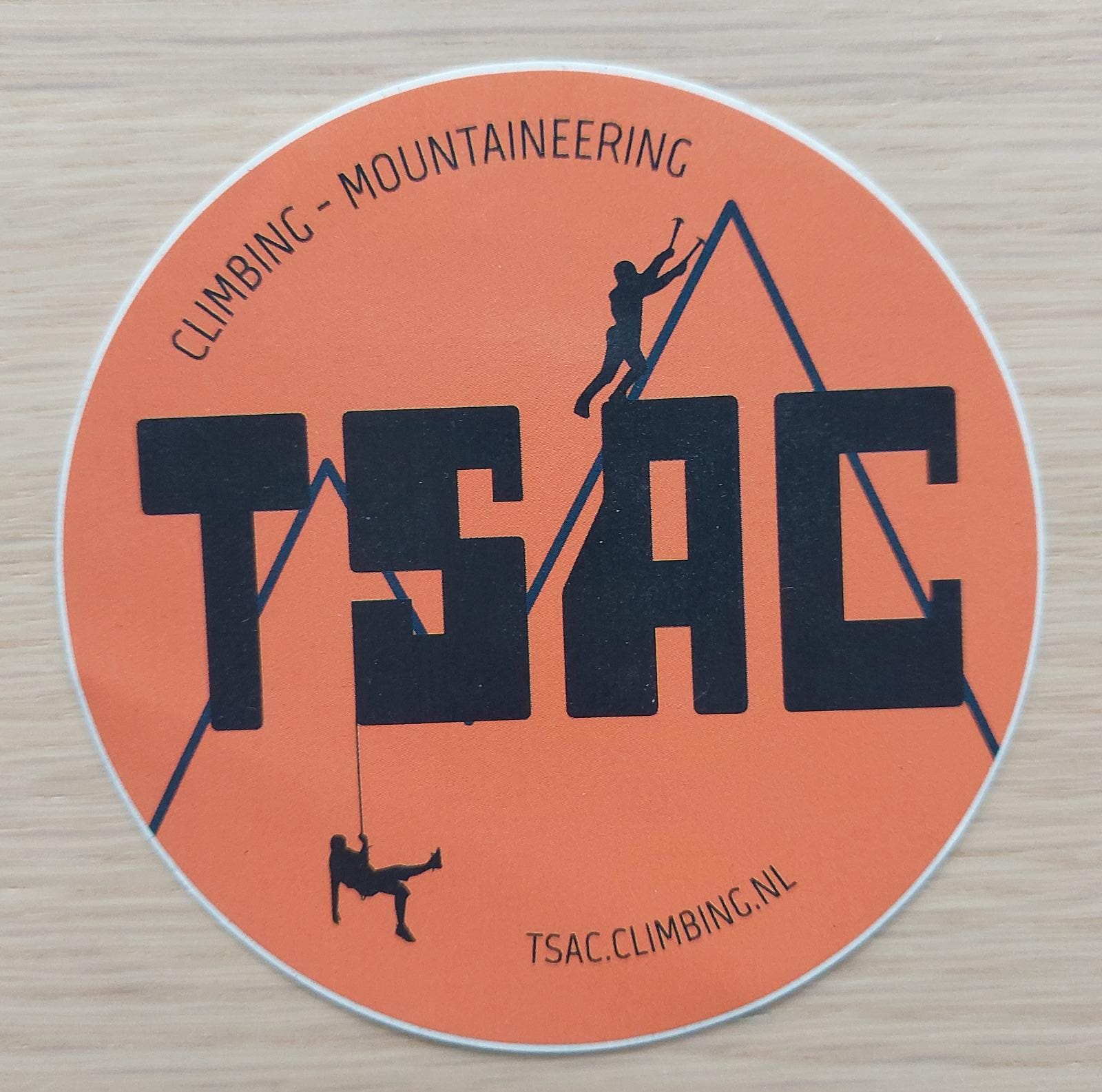
By the 37th, you finally recognise the current TSAC logo and that is central to this sticker: big in the middle without fuss. Its strength lies in its simplicity.
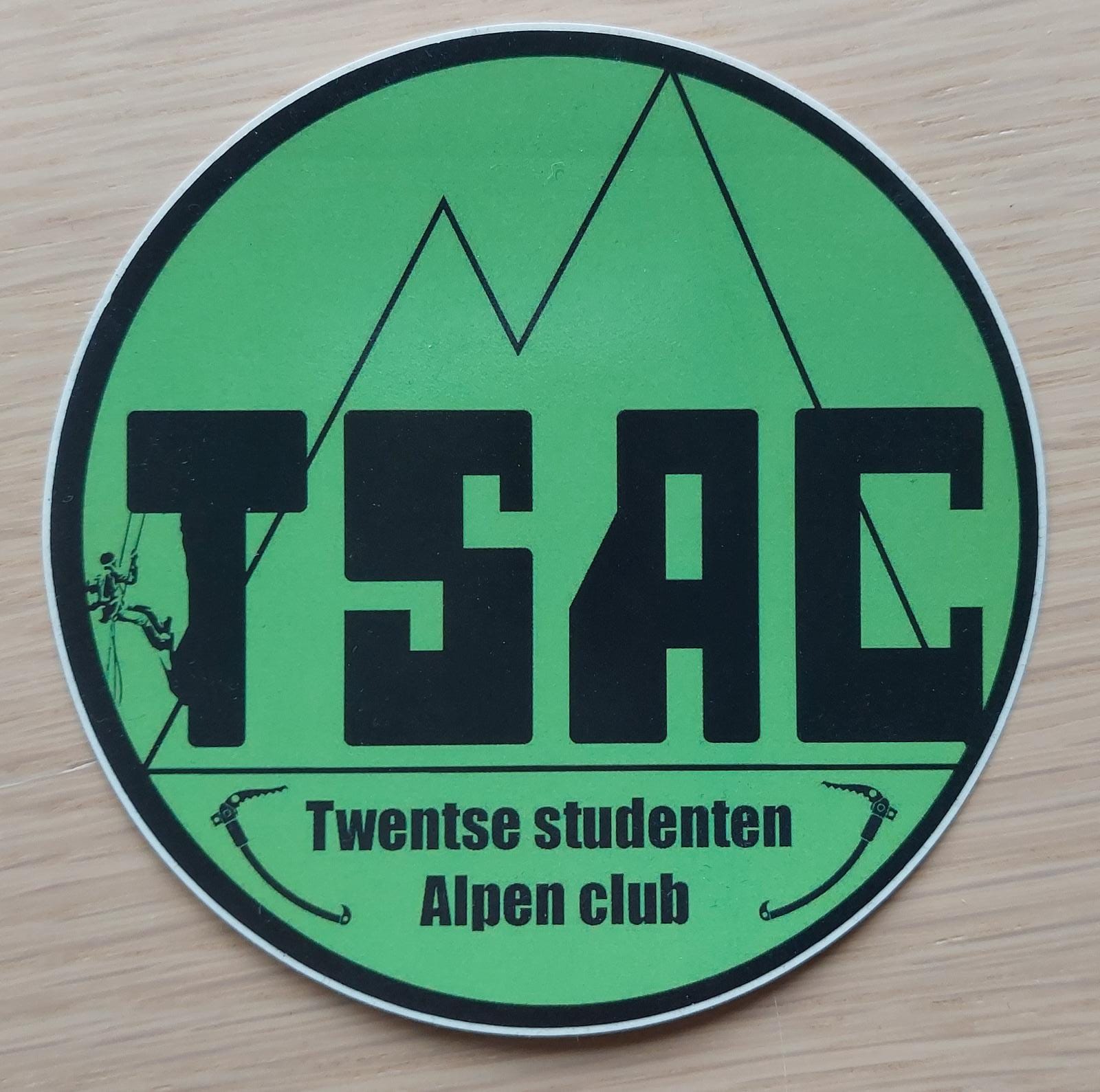
Just like the previous sticker nice and simple. However, the 38th did not like orange that much. A climbing club should be environmentally conscious, TSAC goes green!
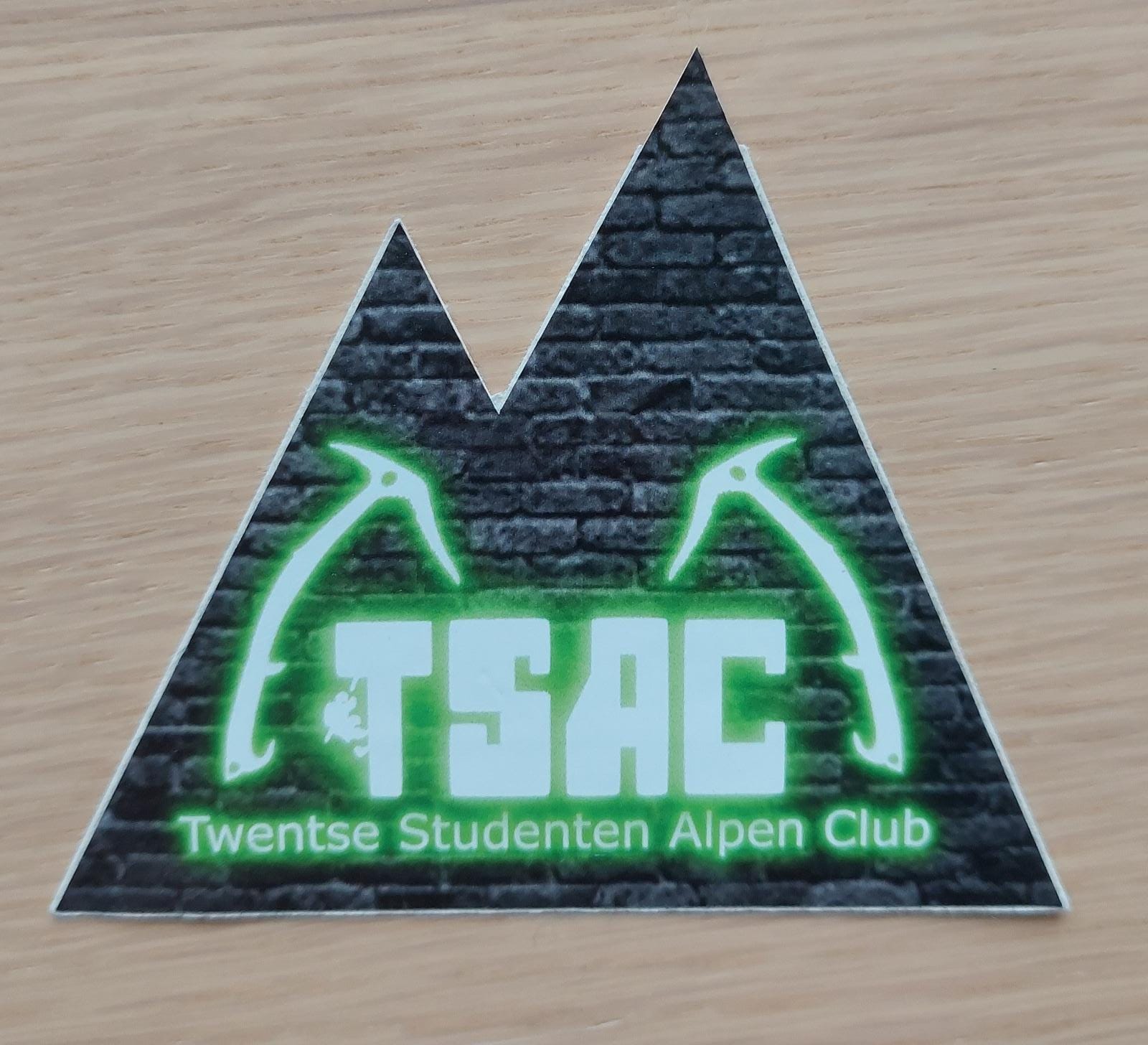
Do you also want to be vintage and retro? The 39th does! A background of industrial bricks in a triangular composition with neon green text. In any case, it stands out...
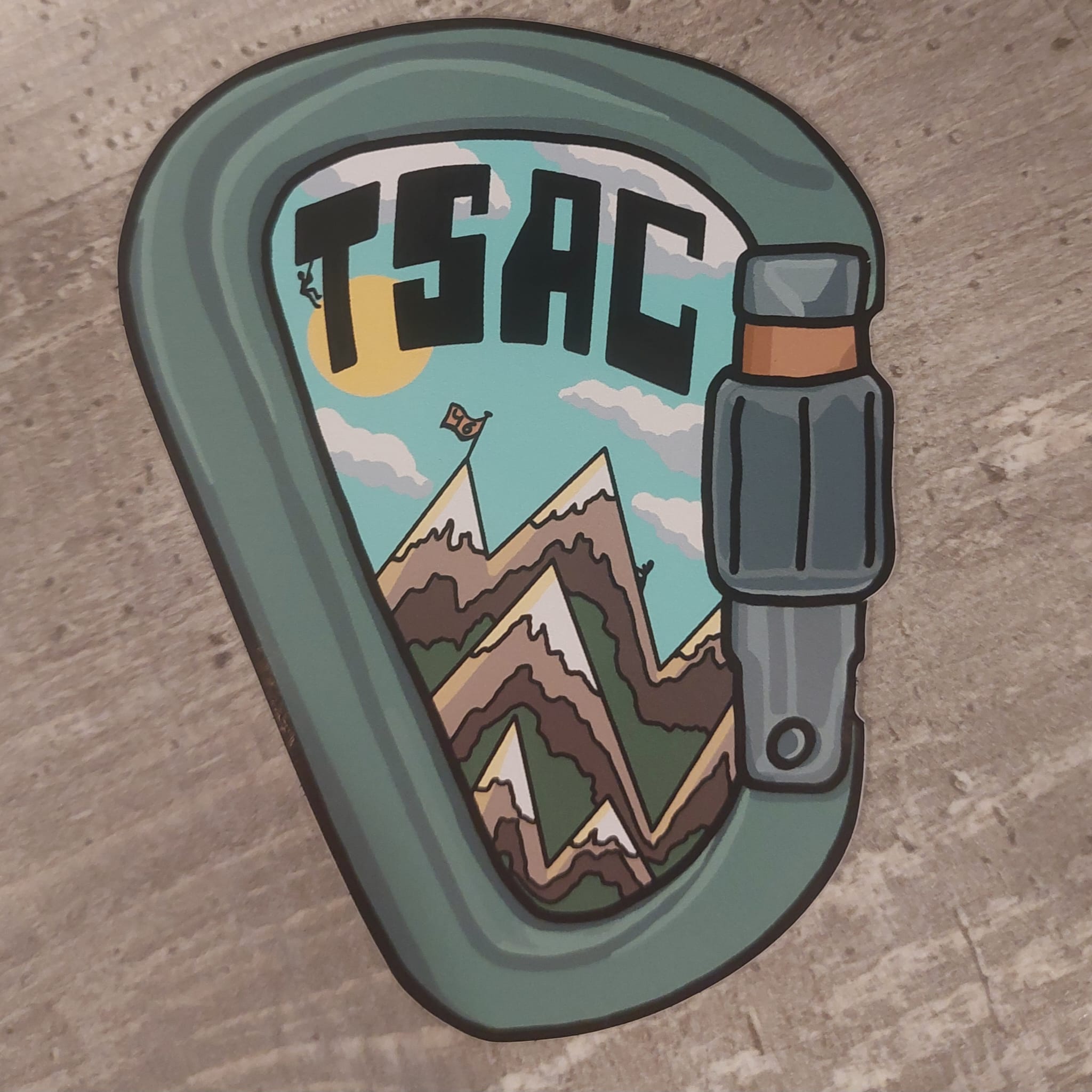
The 40th made the best sticker by far! No one has commented on this design.
Dim had a cool climbing photo of himself and wanted to put it on a sticker. However, the rest of the board was difficult, so Dim just colored himself with paint. If you look closely you can still spot his wild bunch of curls.
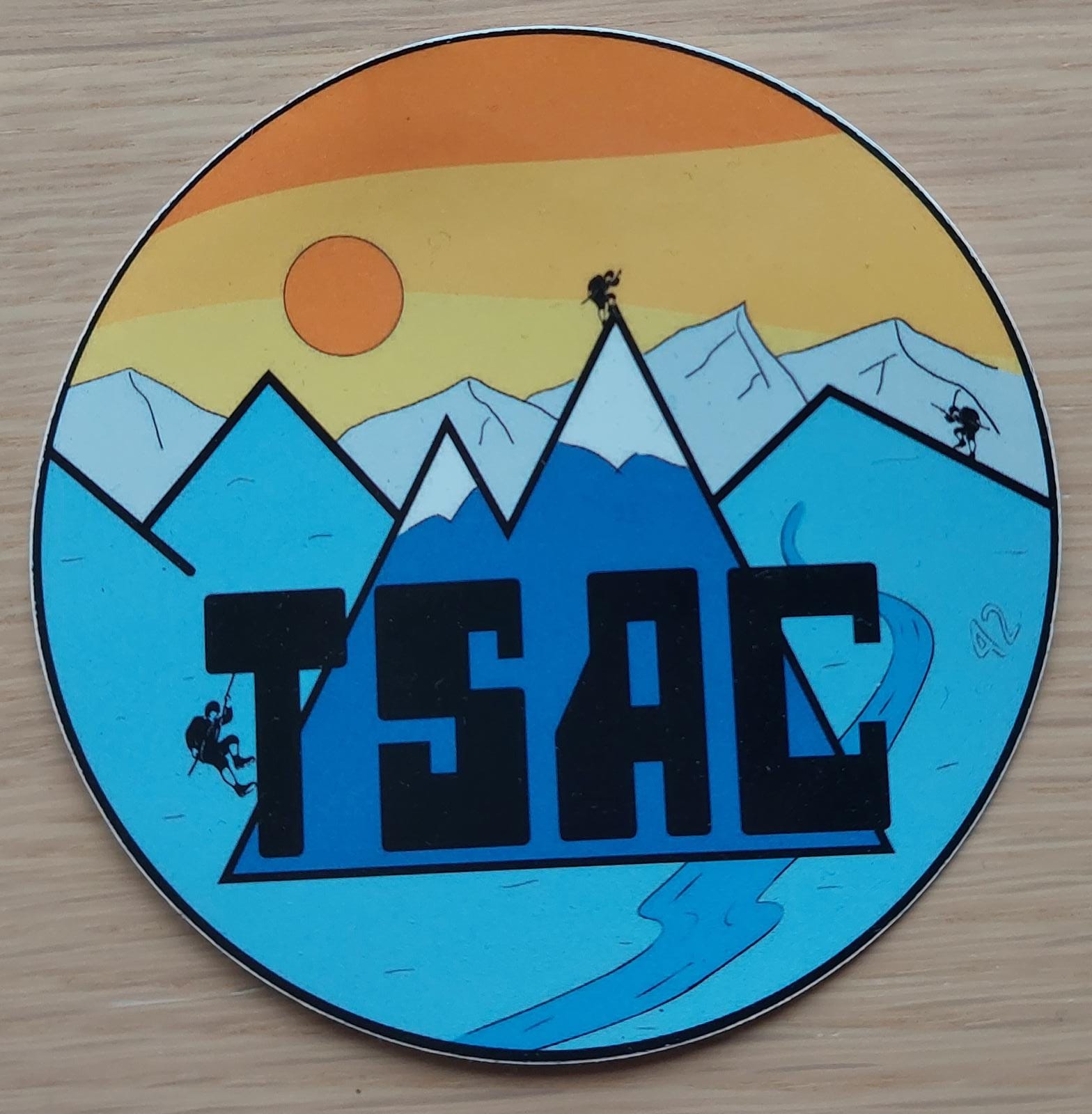
The 42nd board discovered paint and enjoyed drawing a mountain landscape as a 5-year-old with lots of colors. Thanks to the only IDE member they had on their board. Oh and it's the first time the nice board number was shown on the sticker.
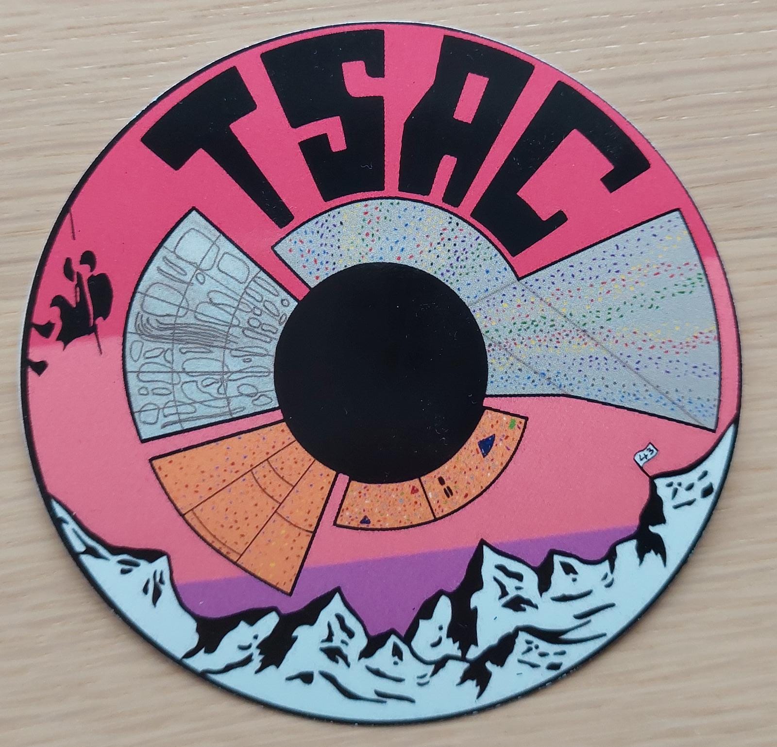
Are you also done climbing outside? We're going back in! A creative decal from the 43rd featuring the TSAC climbing walls. Non-TSAC'ers will have to look twice at what they actually see, but it is original!
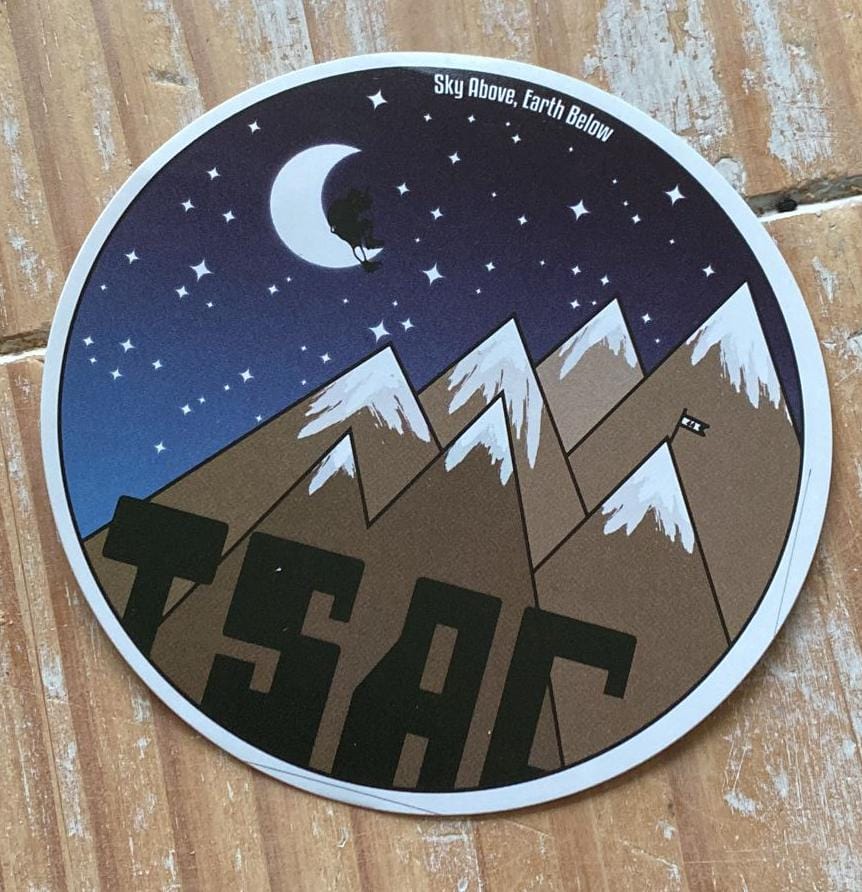
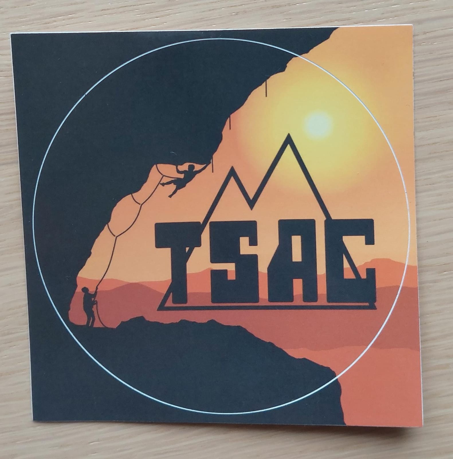
The 44th wanted more. More mountains around the TSAC logo than the 42nd. More sunset than the 41st. Tactically taken the good of their predecessors. And the result is impressive: beautiful mountains under a starry sky. Just a pity about that board quote, adje self hype.
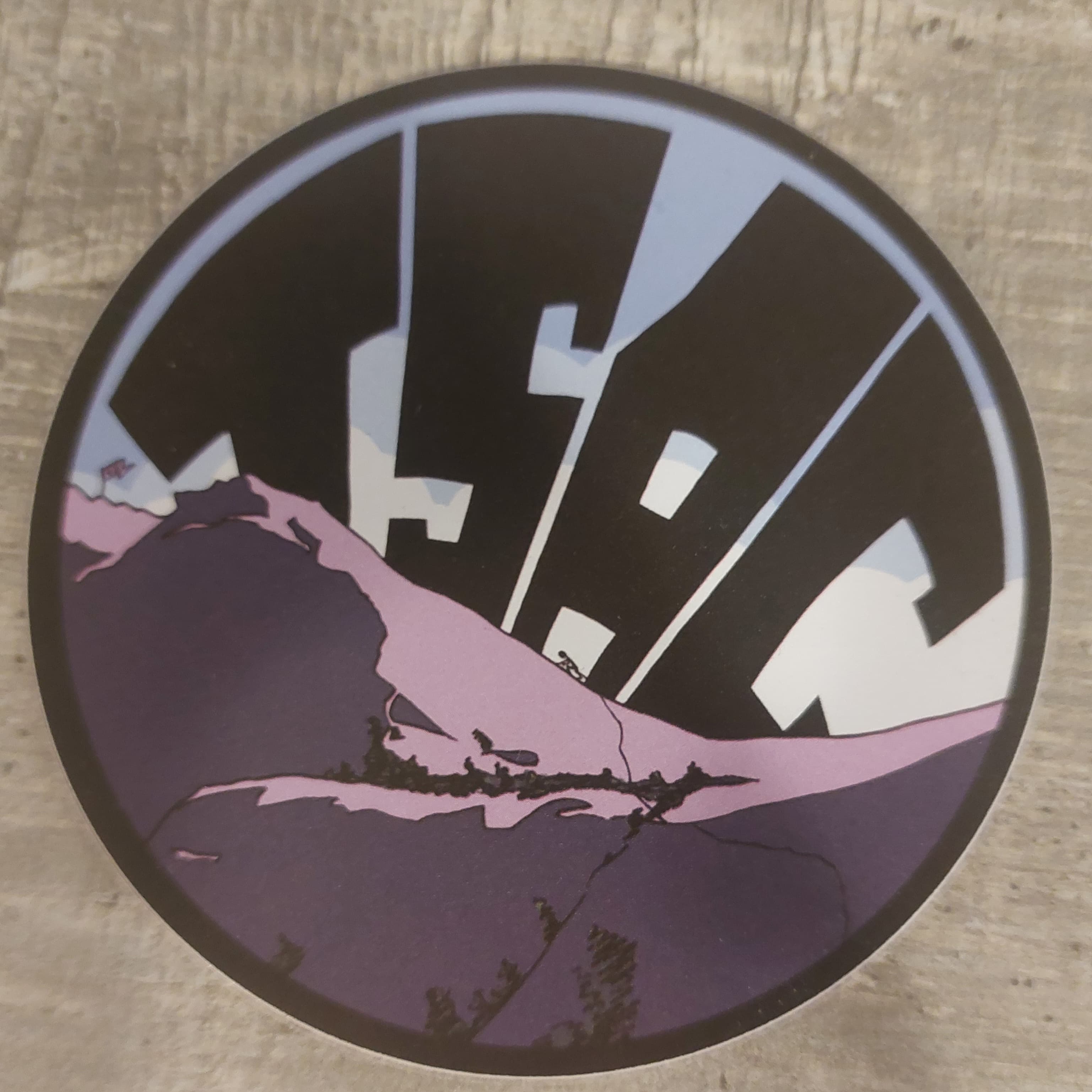
An original sticker from board 45, purple for a change. Really original that you can change the angle of the mountain (more overhang!). Only downside: the TSAC-mountain is missing
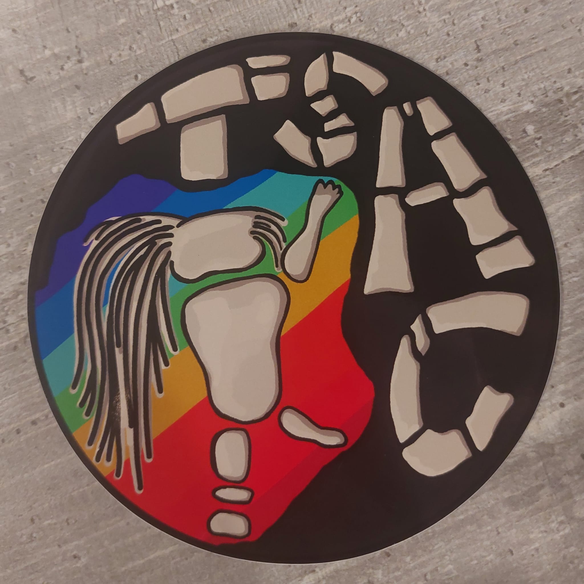
Not a board sticker, but a competition to design a rainbowsticker for TSAC. A deserved winner! Shoutout to Rianne
At TSAC we love to complain, so we'd rather point out everything that could have been better, but to be honest: I think it's a really nice sticker. Original shape, eye for detail and beautifully drawn. It does give off a bit of Pinterest vibes, but that's okay for a change. However, 46 wrongly claimed that this is the first non-round sticker. If only they had looked at this beautiful blog :)